I love this kitchen! It belongs to Chef Tyler Florence, host of the show 'Tyler's Ultimate' on the Food Network, who is seen here chopping up vegetables.
It’s from House Beautiful, and is featured as their “Kitchen of the Year.” The kitchen resides in a house within Rockefeller Center in NYC.
The dark cabinetry against the white subway tile is awesome. Is it a sign that white-on-white kitchens are starting their descend from on top of the must-haves in interior design? I don’t think I’m quite over them, but it’s nice seeing other styles.
Now, onto today’s post…
This photo from last post, kicked my interest about kitchen window treatments into full drive.
I wasn't sure about the short curtains that are covering only half of the window. To me, they just seem sort of misplaced in an otherwise pretty kitchen.
Kitchens are the heart of the kitchen, or so they say. Moms spend lots of time in the kitchen. The kitchen window is a way for a mother to peak out into the backyard to watch her kids playing. I never have thought much about kitchen window treatments, so I figured I could start with a post.
Curtains can be hung mid-window! And there’s even a name for hanging them in this place…café curtains! Ahhh.
It is also completely acceptable for kitchens to not have curtains. Curtains add a level of dressiness that you may not like. It’s really about personal interest. If you don’t like curtains, but need privacy, shutters are good alternatives that require less maintenance.
It bet it could get warm in this kitchen! Maybe this is somewhere in the mountains. Surely not in Texas!
A gray and white kitchen. Shelving is either below and/or in a pantry.
If you do wish to dress up your kitchen, there are a few options you have.
Roman Shades, linen is a good fabric for roman shades. Roman shades can be recognized for their ease of raising or lowering by a cord.
Via Pinterest
Dana Wolters Interior Design
I will do a post on Dana Wolters sometime. She's fabulous. There are great things in this kitchen. The gray subway tile is a nice alternative to the white tile. And the refrigerator is tucked nicely away disguised as cabinets.
And look at the built-in cooler at the end of the island! These people must be entertainers. Lastly, I like the hanging lanterns. They're a nice mix between rustic and elegant.
If I couldn't do hardwood in my kitchen, A close second would be this brick. This kitchen is so warm with all the gold tones. The brick floor matches the backsplash and countertops.
I could post many more kitchens with roman shades. In my stash, I've unknowingly saved a lot of photos with roman shades. I’m seeing a trend: roman shades and farmhouse sinks.
Curtains/drapes
White sheer curtains in this fabulous kitchen via Cote de Texas
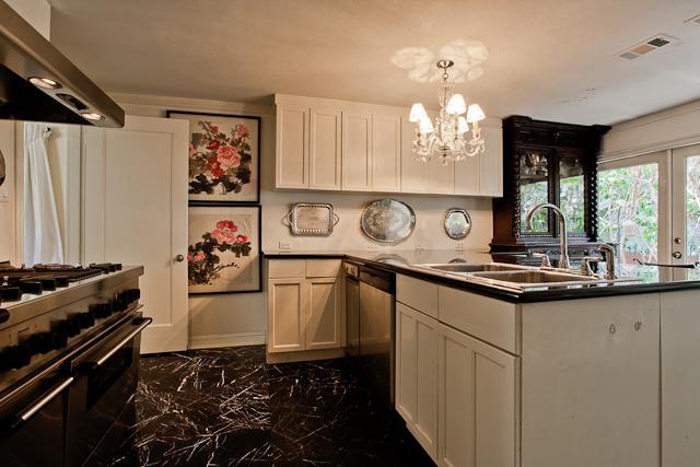
This is the kitchen of the home that the movie It's Complicated, with Meryl Streep, Alex Baldwin, and Steve Martin was filmed at. The Spanish style home was used when exterior was being filmed. But if you watch the movie, this kitchen won't look familiar because the interior scenes were filmed on a sound stage in NYC. This is from the listing when the home was on the market a few years ago!
If you have a stove near the window, it is not really smart to put flammable and swishy curtains there.
Valances offer a more casual look
Mid-century chairs in a contemporary and bright kitchen via House Beautiful
Pretty white-on-white kitchen with a valance covering a natural fiber roman shade. I think this is a marble backsplash (that reaches the ceiling)! The veining in the tile resembles marble. Can someone confirm?
For full length windows, here are some general tips for hanging curtains:
Hang above the frame
If you mount the rod four to six inches above the frame, or halfway between the frame and the ceiling molding, it creates an illusion of a taller window.
Hang Wider Than the Frame
By extending the rod three to six inches beyond the frame on each side, it will make the window feel grander than it actually is. This causes the fabric to actually hang against the wall and not block the glass. It also allows extra light to stream in when curtains are open. To achieve this, you must attach the rod to the wall, and not the molding surrounding the window.
Generally, hanging curtain brackets on the wall above and outside the window molding looks best; it allows fabric to fall gracefully.
In formal rooms, like a dining room or a kitchen with a full length window, 5 or 6 inches of fabric pooling on the floor can look romantic. It’s a bit more traditional English to have several inches of curtain on the floor.
On The Floor.
It’s also more maintenance; curtains need refluffing every time you vacuum or the cat lays on them.
But boy is it dramatic and grand-looking!

By Houston Designer, Pam Pierce. Yet, another person deserving of a post...
Kitchen, Via Cote de Texas
So what are your thoughts on kitchen curtains? Yay or Nay? If so which ones would you actually hang?
And I thought I’d leave you with this beautiful room


